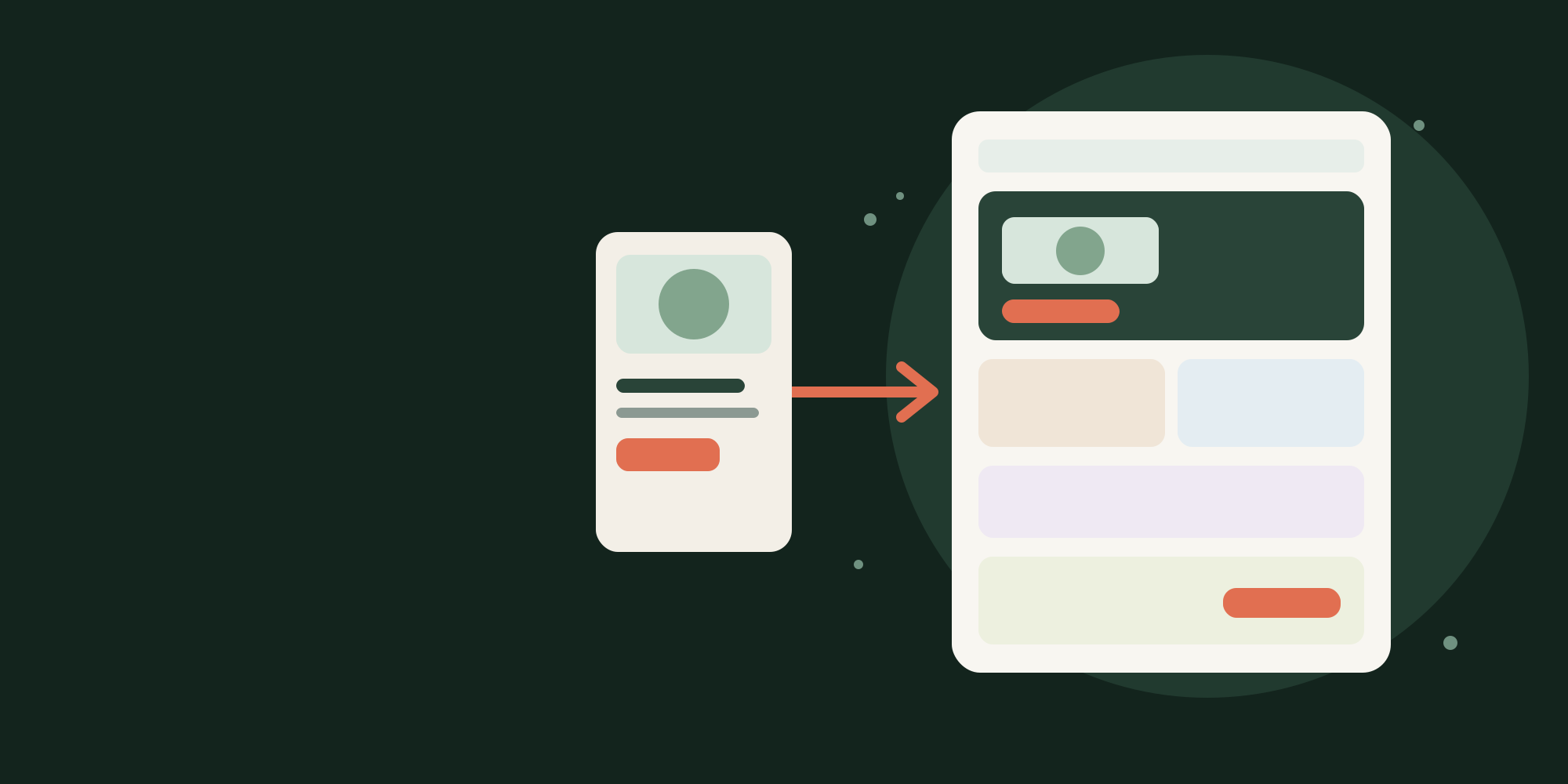

A paid ad can earn the right click and still send the visitor into the wrong conversation. The creative promises one outcome, audience, bundle, or price. The landing page opens with a general brand headline, a different image, and no visible path to the promised action.
That is an ad-to-page continuity problem. It is not solved by adding more badges or redesigning the entire store. Start by checking whether the destination continues the decision the ad began.
Start with the promise, not the page template
Google Ads advises advertisers to match the landing page to the ad and its call to action. That principle applies beyond search advertising. A visitor should not need to reinterpret the offer after clicking.
Create a short continuity record for one campaign:
- Audience: Who does the ad address?
- Outcome: What change does it promise?
- Offer: What product, bundle, price, or incentive is shown?
- Proof: What gives the claim credibility?
- Action: What does the ad ask the visitor to do?
Compare those five fields with the first useful screen of the destination page. Exact wording is not required. Continuity means the meaning is still intact.
If an ad promotes a starter bundle for first-time buyers, a general product page that leads with every variant may create unnecessary work. If the ad simply introduces the product, and the existing product template already carries the same promise and offer, a separate landing page may add no value.
Answer five questions in order
The proposed layout is a decision bridge. Each section has one job.
- Am I in the right place? Repeat the campaign outcome and show the same product or offer context. Keep the primary action visible.
- Is this for me? Describe the use case, customer situation, and important exclusions. Let visitors disqualify themselves honestly.
- Why should I believe it? Explain the mechanism, ingredients, materials, process, or comparison needed to understand the claim.
- What proof supports this decision? Place relevant reviews, demonstrations, certifications, or measured evidence beside the claim they support.
- What exactly do I get? Present the bundle, price, delivery expectations, returns information, product choices, and next action as one decision unit.
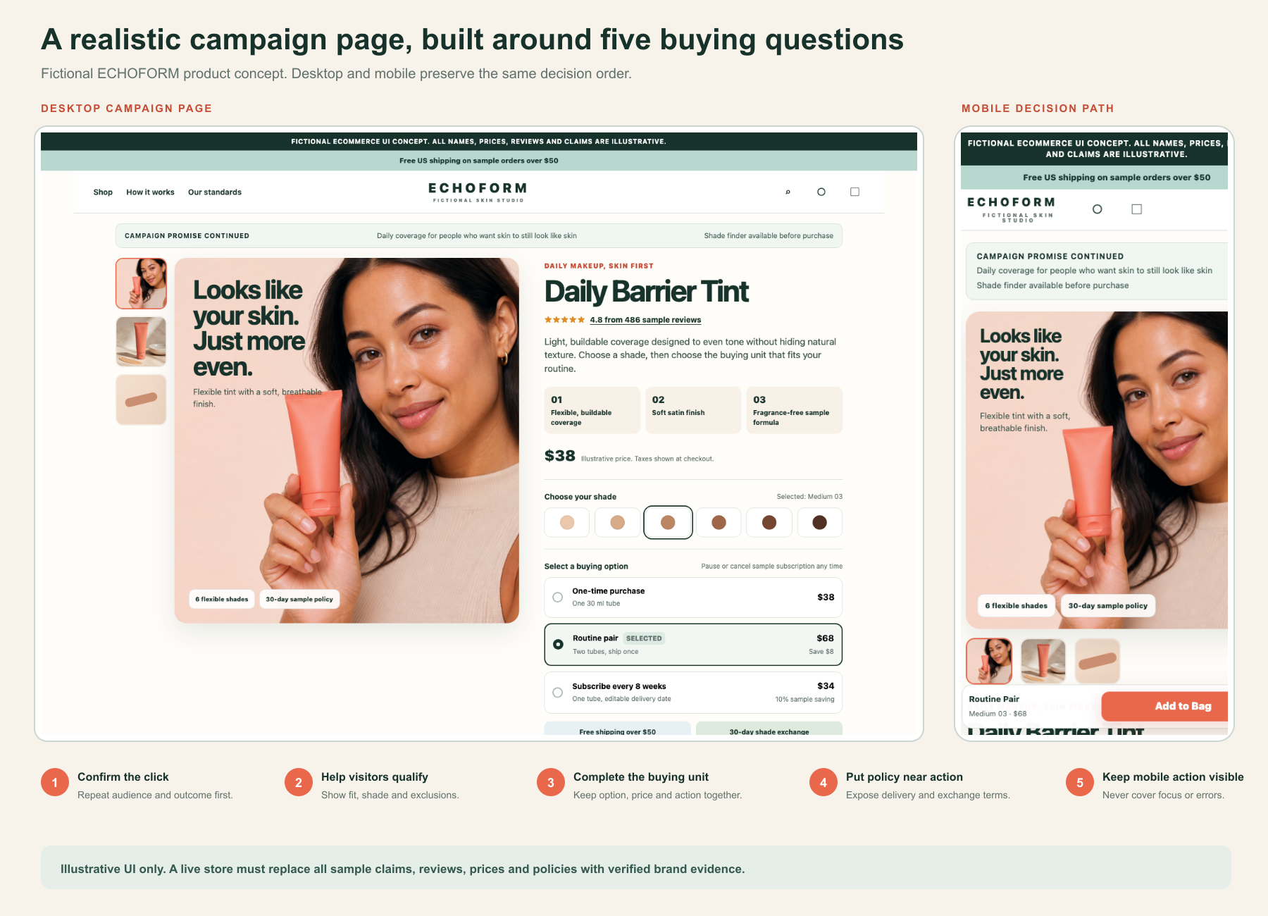
Do not force every campaign into a long advertorial. A familiar product, strong intent, and simple offer may need only the hero, proof, and buying unit. A new category or unfamiliar mechanism may require education and comparison. Page length should follow decision difficulty.
Design mobile as its own decision path
Stacking the desktop page is not enough. On a small screen, the visitor must still see the outcome, offer, and first action without navigating a decorative carousel.
Use one primary headline, one supporting sentence, one representative product image, and one action. Keep secondary links visually quieter. Product choices should use labeled controls with visible selected, unavailable, focus, and error states.
WCAG 2.2 requires a meaningful reading sequence, sufficient contrast, logical focus order, and a minimum target-size approach. A practical purchase button can use a 44 CSS pixel height, which is larger than the Level AA minimum target requirement. If a sticky CTA is used, it must not cover focused controls, product choices, legal information, or error messages.
Avoid autoplay video and heavy comparison sliders in the first screen. They can delay the main content, introduce interaction work, and complicate keyboard access. Use a poster image with a clear play control when a demonstration is essential.
Build it with reusable Shopify sections
Shopify supports multiple versions of page and product templates. JSON templates allow merchants to arrange sections in the theme editor. That makes an alternate campaign template a useful starting point when several campaigns share the same layout logic.
A practical section model includes:
- Campaign promise hero
- Audience and use-case panel
- Mechanism or product explanation
- Claim-specific proof block
- Offer and product-form section
- Delivery, returns, and FAQ block
Keep product data in the product object, product form, metafields, or approved app blocks instead of duplicating price and availability as static campaign copy. Use section settings for campaign-specific headlines, supporting media, proof selection, and offer framing.
Shopify recommends using HTML and CSS for core theme functionality, with JavaScript as progressive enhancement. Keep above-the-fold media responsive, avoid lazy loading the main image, defer non-critical scripts, and load lower sections only as needed. Use field data to monitor current Core Web Vitals rather than treating a single laboratory score as proof of customer experience.
Measure continuity, not only the final sale
Shopify standard customer events include page viewed, product added to cart, checkout started, and checkout completed. Add narrowly defined custom events only when they answer a decision question, such as campaign primary CTA clicked, proof opened, or offer option selected.
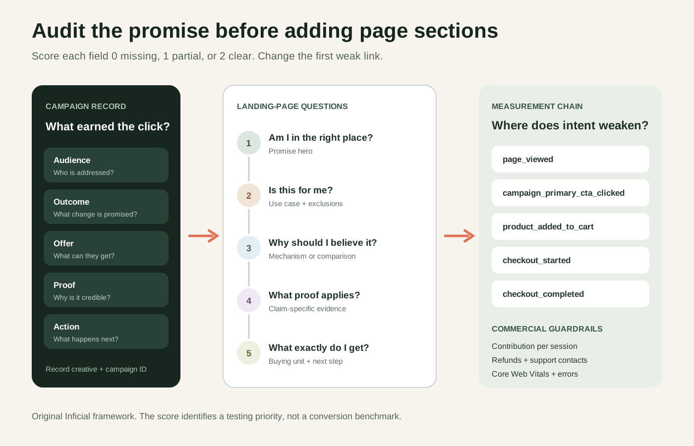
Use contribution profit per landing-page session as the commercial decision metric when cost data is available. Review purchase rate, add-to-cart rate, checkout-start rate, average order value, refunds, support contacts, and page performance as guardrails. A higher purchase rate can still be a weak result if the campaign attracts poor-fit orders or the offer removes too much contribution.
Keep campaign and creative identifiers in the analytics plan. A page-level average can hide one well-matched ad and one badly matched ad using the same destination.
Run this test this week
Choose one paid campaign with a stable offer and enough recent landing sessions to inspect. Do not rebuild the whole page.
- Write the campaign audience, outcome, offer, proof, and action.
- Score the destination from zero to two for each field: missing, partial, or clear.
- Watch five to ten representative mobile sessions if you have consented session replay, or conduct five moderated task walkthroughs without collecting private customer data.
- Change the first weak section only. For example, replace a general hero with the promised outcome, offer, and relevant product image.
- Compare the same campaign and audience before and after the change, or run a controlled split test when traffic supports it.
Set the test duration and sample requirement from your traffic and baseline, not a generic blog benchmark. Document campaign changes, promotions, stock problems, and tracking gaps that could weaken the conclusion.
When not to create a dedicated campaign page
Keep the existing product or collection page when it already matches the campaign, when inventory and pricing change too quickly to maintain parallel copy, or when traffic is too fragmented to evaluate another template. Avoid a separate page if it creates duplicate legal claims, inaccessible app widgets, inconsistent variants, or a slower buying experience.
The goal is continuity, not another URL. A campaign page earns its place when it makes one paid promise easier to understand, verify, and act on.
Inficial can help design the page, implement reusable Shopify sections, and plan a measurable CRO experiment without turning the campaign destination into a second storefront to maintain.
Sources
- Optimise your ads and landing pages, Google Ads Help, accessed August 15, 2026
- Templates, Shopify developer documentation, accessed August 15, 2026
- Building with sections and blocks, Shopify developer documentation, accessed August 15, 2026
- Standard Events, Shopify developer documentation, accessed August 15, 2026
- Performance best practices for Shopify themes, Shopify developer documentation, accessed August 15, 2026
- Web Vitals, Google web.dev, accessed August 15, 2026
- Web Content Accessibility Guidelines 2.2, W3C, accessed August 15, 2026