
A comparison table should make a product choice easier. Too often it does the opposite: six crowded columns, vague checkmarks, inconsistent specifications, and a mobile version that asks shoppers to remember what just disappeared off-screen.
The fix is not a prettier table. It is a smaller, better-governed decision experience built from products that genuinely belong together and facts the team can keep accurate.
First decide whether comparison is the right tool
Comparison is useful when several products solve the same job and differ on facts that change the purchase. Think coffee machines with different capacity and maintenance needs, equipment with compatibility limits, or a good-better-best range with verifiable trade-offs.
| Shopper decision | Comparison fit | Better alternative |
|---|---|---|
| Products share a job and differ on measurable specifications | Strong | Not applicable |
| A tiered range has clear quality and price trade-offs | Strong | Consistent tier cards may be enough |
| Choice depends mainly on colour, finish, or personal taste | Weak | Strong imagery, filters, and saved items |
| Eligibility depends on a sequence of constraints | Weak | Guided finder before comparison |
| Products cannot share honest definitions or units | Reject | Separate buying guides or consultation |
Editorial callout: If two values do not share the same definition and unit, placing them in the same row does not make them comparable.
Choose the product set before choosing the layout
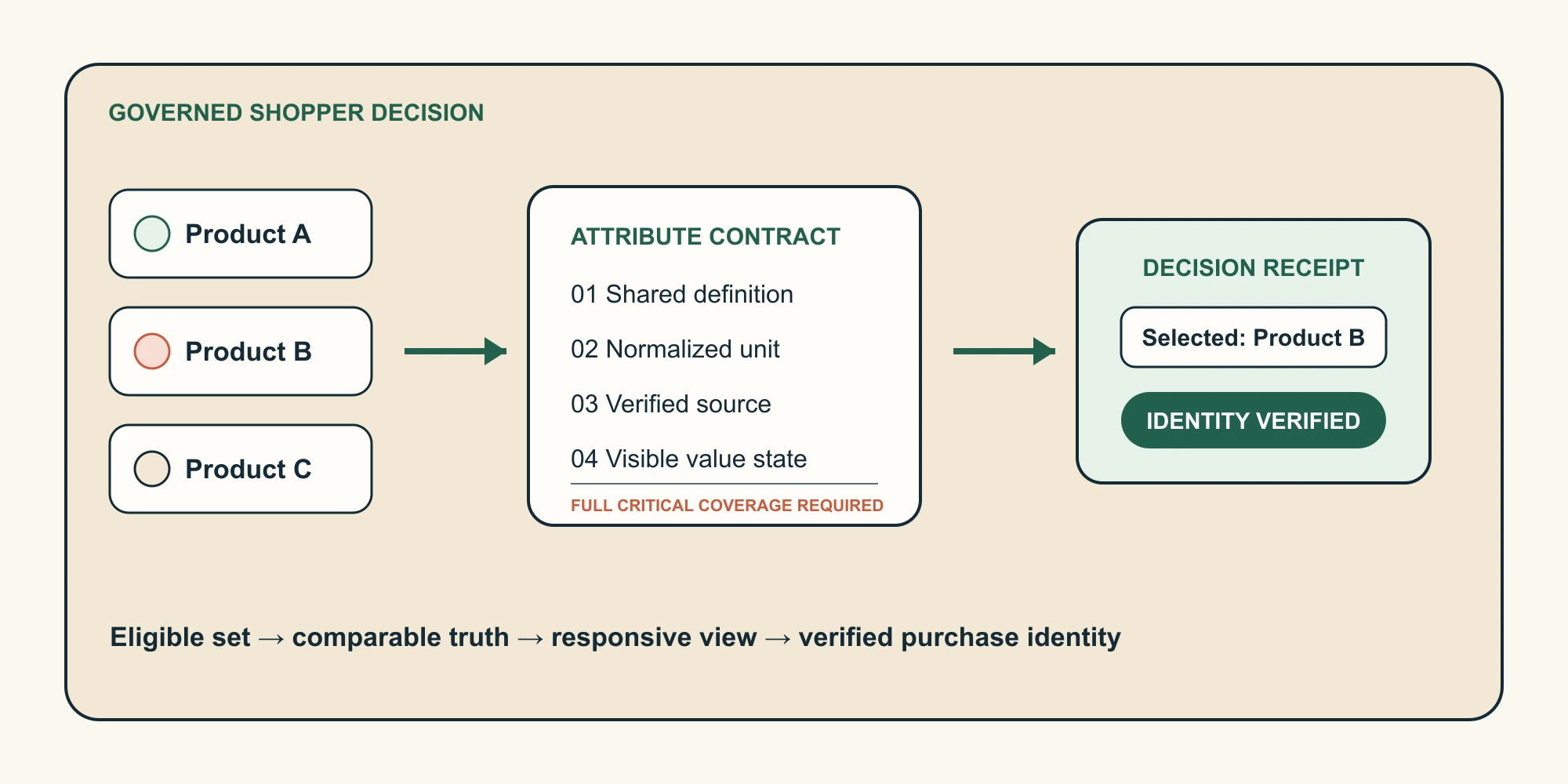
Start with the smallest useful set. Every extra product increases width, selection effort, data maintenance, and the chance that mobile becomes unusable. The eligible set should be explainable in one sentence.
- Name the shopper job the products share.
- Write the rule for including and excluding a product.
- List the attributes that can change the choice.
- Remove any product that cannot meet the critical-data standard.
Do not mix separate products with variants simply because both appear in the same merchandising range. A variant is a purchasable option within one product state. A comparison table is for separate product identities that shoppers may evaluate side by side.
Build one source of comparison truth
Handwritten table copy creates a second product record that eventually drifts. Store values with the product that owns them, and keep reusable attribute definitions in a structured model. On Shopify, that usually means product metafields for product-owned values and metaobjects for reusable definitions or referenced entries.
| What must be defined | Decision to record | Release evidence |
|---|---|---|
| Eligible set | Which products may appear together? | Named cohort and exclusion rule |
| Attribute | What does the row mean and which unit applies? | Versioned label, definition, unit, and priority |
| Value state | Is the value verified, unknown, stale, or not applicable? | Source, reviewer, and review date |
| Responsive view | What leads on desktop and mobile? | Approved hierarchy and interaction tests |
| Purchase handoff | Which identity leaves the comparison? | Destination and returned cart receipt |
| Ownership | Who reviews values and removes the tool? | Owner, service level, rollback, and exit test |
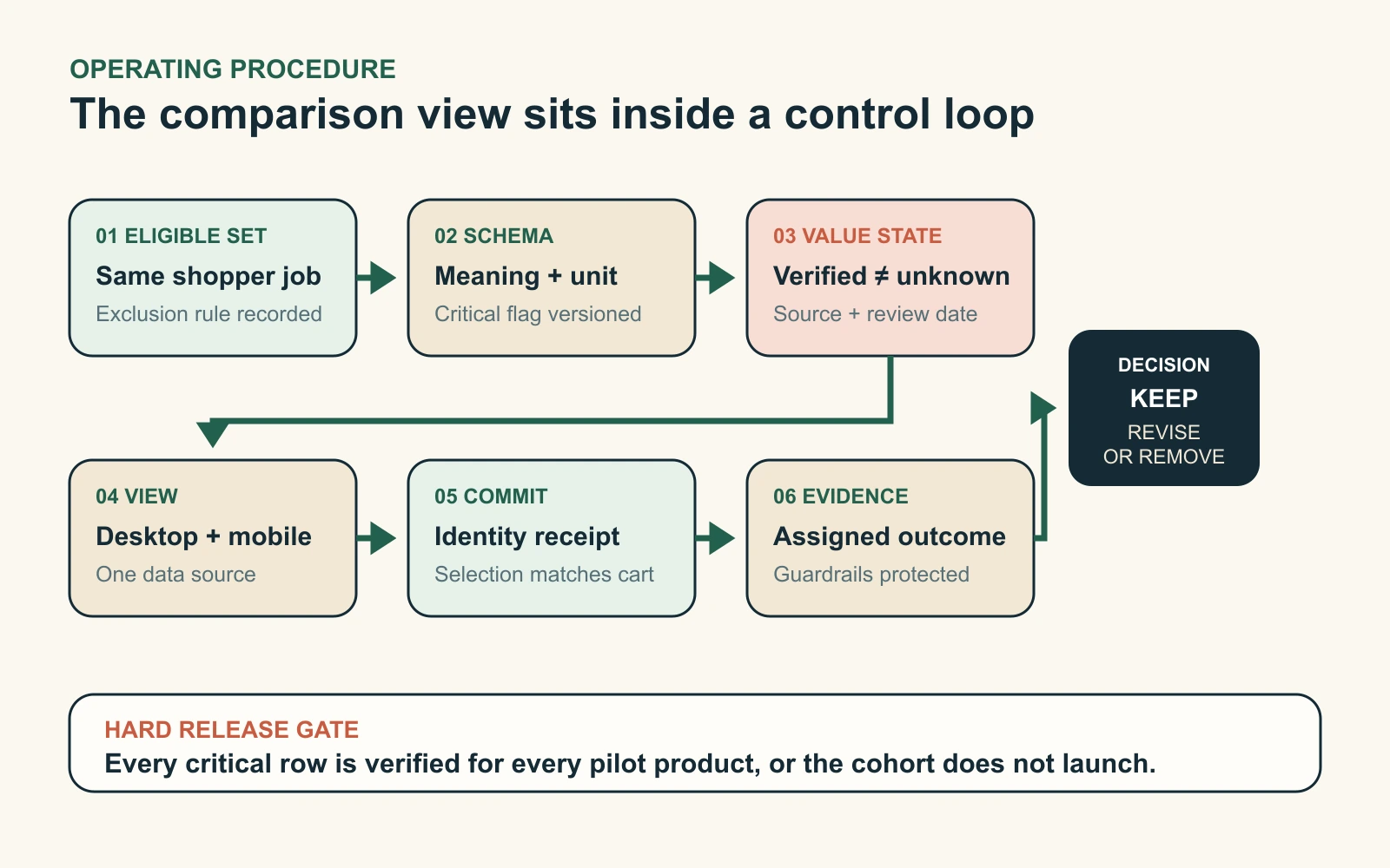
Use one hard release rule: every decision-critical row needs 100% verified coverage for every product in the pilot. If capacity, compatibility, price basis, warranty, or another choice-changing fact is unknown, repair the catalog or remove the product from the cohort.
Treat missing values as warnings, not empty cells
A blank cell hides the reason a value is missing. The shopper cannot tell whether nobody entered it, the attribute does not apply, or the information is no longer current. Give each state an explicit treatment.
| Value state | What the shopper sees | What the team does |
|---|---|---|
| Verified | Normalized value and unit | Retain the source and review date |
| Unknown | Unknown, or no product in the comparison | Create a correction and block critical gaps |
| Stale | Nothing presented as current truth | Reverify, hide the row, or remove the product |
| Not applicable | Not applicable with context when needed | Exclude it from missing-coverage counts |
| Market-dependent or unavailable | The current boundary and a valid next route | Test availability, units, translation, and recovery |
Avoid awarding a winner because one product has more checkmarks. A feature may help one shopper while adding cost or complexity for another. Explain the consequence of each difference and let the shopper decide.
Design the mobile experience first
Desktop can show several products against shared rows. Mobile cannot preserve that density for free. Choose the relationship that matters most: scanning one attribute across products, reading one product at a time, or reviewing only the differences in a shortlist.
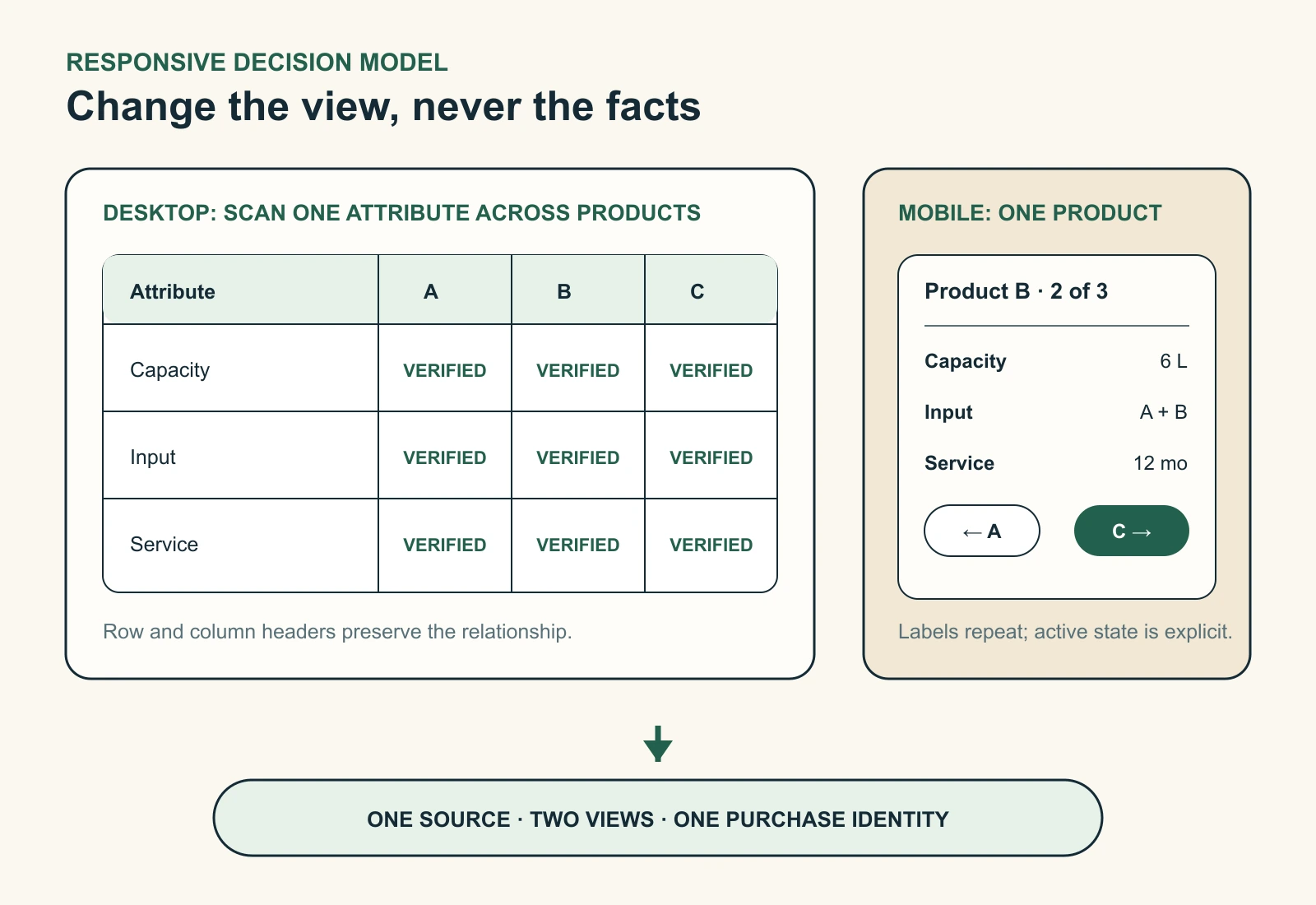
- Use a semantic table when rows and columns carry the meaning.
- Contain horizontal scroll inside the comparison region, not the whole page.
- If mobile uses cards, repeat every attribute label and expose the active product.
- Keep selection, removal, difference controls, and purchase actions keyboard operable with visible focus.
- Use text for unknown, unavailable, included, and excluded states; never rely on colour alone.
A product-at-a-time view is easier to read but weakens simultaneous scanning. A scrollable table preserves alignment but adds navigation effort. Test both with real product names, longest labels, touch, keyboard, zoom, and screen-reader paths.
Choose the smallest implementation that can stay accurate
| Approach | Use it when | Require before approval |
|---|---|---|
| No comparison tool | Cards already communicate the few meaningful differences | Consistent facts and return-to-list behaviour |
| Theme section | The cohort and schema are narrow and stable | Server-rendered HTML, dynamic data, responsive tests, and a performance budget |
| Comparison app | The store needs dynamic selection, imports, analytics, or vendor support | Permissions, accessibility, performance, export, pricing, and disable tests |
| Guided finder or custom application | Eligibility is sequential or spans complex markets and services | Explainable logic, fallback, observability, security, and a long-term owner |
Installation is not acceptance. Test representative products, long labels, missing values, multiple languages, an unavailable product, app disable behaviour, and data export before committing the catalog or theme to a solution.
Verify the path from comparison to cart
- Resolve the eligible cohort for the current market.
- Restore only product identities that remain eligible.
- Render initial facts and controls in HTML, then enhance the interaction.
- Before enabling the CTA, confirm identity, price context, availability, and destination.
- Compare the returned cart identity with the product or variant the shopper selected.
If the handoff fails, keep a direct product-page route available and record the error. Shopify's product_viewed and product_added_to_cart events can anchor the surrounding commerce journey; custom events should describe only the comparison interaction.
Test whether the table improves the decision
Start with one stable, specification-led collection. Freeze the product set and comparison rules where practical, then randomly assign eligible sessions to the comparison experience or the current product-card path.
| Evidence | Measure | How it changes the decision |
|---|---|---|
| Integrity | Critical coverage and product or cart identity mismatches | Any critical mismatch blocks release or triggers rollback |
| Primary outcome | Valid product-detail-to-cart completion per eligible assigned session | Tests the purchase decision without selecting only comparison users |
| Diagnostics | Products added, differences viewed, selection time, unavailable recovery | Explains where the experience helped or failed |
| Commercial and customer guardrails | Contribution, returns, cancellations, and support contacts | Protects economics and trust |
| Experience and maintenance | INP, layout shift, keyboard completion, overflow, coverage breaches, review latency | Protects usability and operating effort |
Do not treat comparison-open conversion as causal; those shoppers selected themselves. Use assigned-session outcomes for the decision and interaction metrics for diagnosis.
Roll back immediately for a reproducible product, price, availability, or cart-identity mismatch; a broken keyboard path; page-level overflow; or two consecutive performance-budget breaches. Set the store's commercial and customer-trust limits before the test begins.
Give the comparison table an owner and an end date
- ✓Version the attribute schema and explain why each critical row changes the decision.
- ✓Run coverage reports and recheck values after imports, supplier changes, market launches, and releases.
- ✓Keep desktop and mobile parity in one acceptance test.
- ✓Record data, analytics, support, and rollback owners.
- ✓Test export, disable, and removal before renewal or major theme work.
- ✓Remove the experience when demand is weak, evidence is neutral, or maintenance repeatedly misses its service level.
Take one safe action this week
Create a spreadsheet for one proposed comparison cohort. Put products in columns and candidate attributes in rows. For every cell, record the source, unit, value state, market boundary, reviewer, and review date. Mark every row that can change the choice as decision-critical.
Do not change the live theme yet. If any critical row lacks verified coverage, repair the catalog or narrow the cohort. If coverage is complete, prototype desktop and mobile from the same data and write the test and rollback rules before choosing an app or section.
Inficial can audit the product data, design the responsive comparison experience, implement the smallest suitable Shopify solution, and build the measurement and maintenance controls around it.
Frequently asked questions
Does Shopify have a built-in product comparison table?
Should a comparison table use products or variants?
How many products should a product comparison table include?
How should a product comparison table work on mobile?
Should comparison data live in metafields or metaobjects?
How do you measure whether a comparison table helps?
Sources
- Shopify developer documentation: Data modeling with metafields and metaobjects, accessed September 1, 2026
- Shopify developer documentation: Dynamic data sources, accessed September 1, 2026
- Shopify developer documentation: Performance best practices for Shopify themes, accessed September 1, 2026
- Shopify developer documentation: product_viewed standard event, accessed September 1, 2026
- Shopify developer documentation: product_added_to_cart standard event, accessed September 1, 2026
- W3C Web Accessibility Initiative: Tables tutorial, accessed September 1, 2026
- W3C Web Accessibility Initiative: Understanding Reflow in WCAG 2.2, accessed September 1, 2026
- Baymard Institute: Product comparison UX for spec-driven industries, accessed September 1, 2026
- Nielsen Norman Group: Comparison tables for products, services, and features, accessed September 1, 2026